by Kay | Mar 27, 2013 | Shelf Analysis |
It’s been awhile since I’ve done a Shelf Analysis – mostly because no YA cover trends have really stuck out for me. But while perusing my 2013 shelf on goodreads, I noticed something somewhat usual… typography!
To those of you who are a bit confused by the term, typography is basically the art of aranging types to make things look gorgeous. To put that in book cover terms: covers where the focus is on the print of the title or the author’s name, rather than an image.
Take a look at these upcoming YA books (this is a bit of a Waiting on Wednesday post, as well!) and you’ll see what I mean!
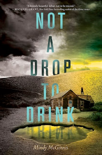
Not a Drop to Drink by Mindy McGinnis
Out on September 10th 2013 by Katherine Tegen Books – goodreads
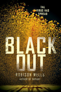
Black Out by Robison Wells
Out on October 1st 2013 by Harper Teen –
goodreads
The Chaos of Stars by Kiersten White
Out on September 10th 2013 by Harper Teen –
goodreads
Between the Devil and the Deep Blue Sea by April Genevieve Tucholke
In The After by Demitria Lunetta
Out on June 25th 2013 by Harper Teen –
goodreads
Snow White Must Die by Neil Neuhaus
Only out in Australia, I’m afraid! *cries* –
goodreads
Typography-focused covers are by no means a new thing, but it is rather unusual to see them in YA novels. My favourites are the covers of Not a Drop to Drink and Snow White Must Die – absolutely stunning! I have no idea when or why these covers came back into fashion, but I fully approve!
by Kay | Aug 18, 2011 | Shelf Analysis |
If you’re new to Dead Book Darling then… Hi. I’m Kay. I love books and hold serious grudges. I don’t forgive and I don’t forget. And just because I love books, that doesn’t mean they are automatically spared my ire.
Often times a gorgeous cover will come out – a cover that says all the right things, makes you swoon and has you running to the chapel. Then, that cover you loved? It changes into a cover you wouldn’t want to be seen in public with. And when that happens, I don’t tend to keep calm and carry on. I hold a grudge.
I’ve addressed this subject before (don’t get me started again on the covers of the Strange Angels series), but a few books that I’m kinda in love with have had their covers changed this year. And while most of these new covers aren’t terrible, someone has to pay homage to their gorgeous but recently-deceased ARC covers…
ARC // Final Cover
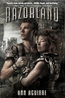
Talk about radically different covers! When I first saw the change my thoughts on the new cover were simple: “meh”. It is a really boring, give-nothing-away cover. It’s nice, but there is no detail. Razorland, on the other hand, was detail mad. It features absolutely gorgeous artwork that fits in well with Ann Aguirre’s other illustrated covers. It also really has the post-apocalyptic, do-or-die feel to it that the book has.
But Enclave is a great non-gender specific YA read. And which cover do I think a teenage boy is more likely to pick up? Er, the Enclave cover of course! So while I am glad that I have the ARC of this book and get to have the “best of both worlds”, I am (reluctantly) glad that they changed the cover. Reluctantly…
US ARC // US Final Cover
I saw the ARC cover to this book ages ago… and went “ick” and promptly forgot about it. Then, months later, I got the UK ARC in the mail and realised that Laini Taylor was also the author of Lips Touch: Three Times (a book I have heard sooooo many great things about). After I finished the book – and loved it – I did a bit of research and found the US ARC cover that I had seen so many months ago.
And now? Now I really really like it!
OK, I so I can admit that it is not the most… coherent of images. It’s a bird, no it’s a girl, no is a turquoise girl – red girl mashup. What on earth is that about?? But trust me when I say that it works for this novel. Out of all the 3 released covers I’ve seen for this novel, the US ARC is the most representative of the content.
But if you haven’t read it… well, then my original “ick” response applies. So, yay! for feathered masks.
UK ARC // Final Cover
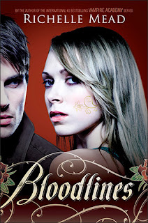
Oh, dear lord. I loathe the US Bloodlines face covers. This one and the already released cover of The Golden Lily. I had always thought the Vampire Academy face covers were alright: not worthy of loathing or loving. But these? These are dreadful. The font is cheesy, the models look annoyingly stuck-up, and there isn’t even a proper background to them. Just… dreadful.
So when the UK publishers released their cover to book, I was rather excited. I hadn’t liked how they had re-issued the Vampire Academy series to give them simple, face-free covers… but they hadn’t done too bad a job with Bloodlines.
Then, shortly after releasing the ARC cover to the blogosphere, they changed their mind. They’ll be using the US face covers to give a more “global” feel to the series.
Nooooo! Why ditch the perfectly nice cover you’ve already designed? The cover that would sit nicely next to the non-face covers you had given to the Vampire Academy series! Why?? And if you honestly wanted a “global” feel, then why on EARTH did you choose the face cover from HELL to spread across the globe. Why??
So while I will, of course, be buying Richelle’s new series… am I a happy bunny? No, I am not.
by Kay | Jul 11, 2011 | Shelf Analysis |
So, I’ve just gotten a look at the cover for the next Lauren Oliver novel, Pandemonium, the sequel to her dystopian YA novel, Delirium. The cover is pretty different to the original Delirium cover, so I think the publishers may be going for a bit of a re-branding. It matches the “special edition” version of Delirium is supposed to be coming out with this new cover sometime in the fall – which will include a Q&A with Lauren Oliver and an excerpt from Pandemonium. Anyhow, take a look:
OK, so the new cover style is very different to the original (which I loved, by the way), but I like it. It’s fierce and a little bit scary, and the fall colours make it look somewhat apocalyptic… In fact, I’d say it’s more like the long lost cover The Hunger Games.
No, seriously.
Is anyone else looking at these covers and seeing Katniss Katniss Katniss? I can just picture Katniss looking just like that, peering at me from behind a bush before killing me. And to prove that I am not the only one who has thought of this, I present the following evidence: the cover to the German edition of The Hunger Games (aka Die Tribute von Panem – Tödliche Spiele)
See what I mean?
I am pretty sure this is just me, but it irks me none the less. Delirium was a fantastic book and, yes, it’s a dystopian YA novel. But is it anything like The Hunger Games? No it is not. And unless the protagonist, Lena, has a dramatic character-modification in the next book, I am not picturing her as the next Katniss.
by Kay | May 27, 2011 | Shelf Analysis |
Once upon a time, I wrote a post about a YA trend that involved hearts. Lots and lots of hearts. Well, apparently hearty covers must really be selling well, as they are still absolutely everywhere. And, the more I looked into it, the more I found heart-astic covers on not-so-recent releases. It’s been something we’ve been stumbling into over the last 5 or so years.
In other words, the heart is here to stay.
While some of these I find rather blah (see Fauxmance), there are also some pretty unusual takes on the idea. Like the last two with a girl making a heart with her hands – it’s cute but also slightly sad…
But my favourite has to be the very first – You Had Me At Halo. The pun is fantastic and the cover adorable – all round, very cute!
Favourites anyone?
by Kay | Feb 22, 2011 | Shelf Analysis |
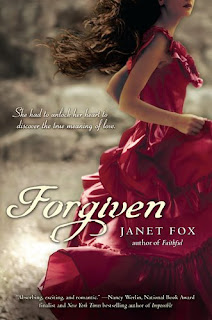
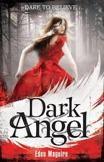
So, has anyone else noticed something rather red about YA covers as of late? Big, red and rather poofy?
Yes, I am talking about all the gorgeous red dresses that are gracing YA book covers. While I absolutely love all these covers, I am rather perplexed by the trend. Was there a fashion notice that I missed? Should I be rushing out and buying matching gowns to go with my books?
I feel like I’ve missed some out – are there any other red dress books I’ve skipped? Not that seven nine is exactly a small number… in fact, I didn’t realise how many red dress books there were out there until I put together this post. And any thoughts on the trend? While I like it, I’m not sure I get it…
by Kay | Jan 15, 2011 | Shelf Analysis |
A word of warning. This post is going to be completely and utterly devoted to book covers that freak me out. Scary, scary covers that make me want to hide under my blanket.
I’ve noticed that a few UF/YA covers have taken a bit of an edge to them. Sure, there are still lots of pretty guys and kick-ass girls, but there are more and more that seem to have use stills from horror films as their cover images. Perhaps we’ve just gotten darker and love the goosebumps when get when we see a scary book cover.
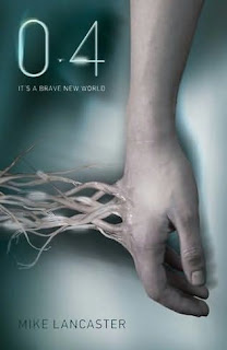
0.4 by Mike A. Lancaster
Eep! There are wires plugged into his veins. Seriously, icky icky icky. Reminds me of that scene in the Matrix when Neo wakes up covered in goo. Also, the cover reminds me a little of tentacles. Scary stuff.
The House of Dead Maids by Clare B. Dunkle
OMG those eyes! I really can’t look at this one too long without feeling like the girl is acccusing me personally. Talk about wanting to run and hide.
The Evil Within by Nancy Holder
Another nightmarish girl on another nightmarish cover. This practically exudes The Exorisist!
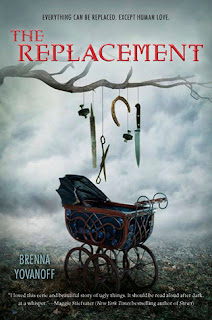
The Replacement by Brenna Yovanoff
The Replacement cover is probably the scariest on here. This is so effective at unsettling people because it deals in binary oppositions – the safety and comfort of a baby carriage vs. the danger and cruelty of sharp instruments. Add to that the spooky fog and dead tree: you’ve got the scariest cover known to man. Whoever made this thing was a disturbed genius, and the UK publishers must have been out of their mind when they replaced it with the blah-cover they’re using now (albeit, less likely to make people want to cry when they see at Waterstones).


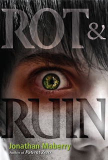
Rot & Ruin and Dust & Decay by Jonathan Maberry
I adore these covers – at least in the sense that they seriously freak me out. They both have that edge to them that screams horror film to me.
So, which is your favourite (i.e. which ones make you want to hide under the covers!)? Or better yet, have I missed out any truly spooky ones from my list?

